
10 of my personal picks for some of the WORST ever album covers!
The bad, the ugly, and the even uglier. Reasons varying from just plain lazyness, lack of graphic design knowhow, and little self awareness.
Before beginning this tierlist, I'd like to showcase some...
HONORABLE MENTIONS
As in, covers that aren't really bad in terms of looks, but rather just funny, or bad in some other way.
6. D>E>A>T>H>M>E>T>A>L and Danzig I - Panchiko and Danzig


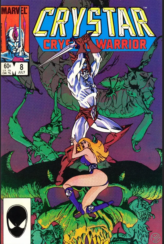
Stolen artwork galore!
5. Nectar - Los Enanitos Verdes

Did a blind man crop this, or did they just not give a fuck?
4. Symphony X, The Damnation Game, The Divine Wings of Tragedy, and Twilight in Olympus (special editions) - Symphony X
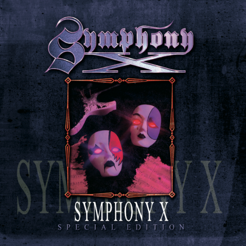


I seriously admire Symphony X's insane creative genius here, absolutely astonishing how they managed to come up with such unique and original covers for their special edition album re-releases.
3. 'the Black Album', Back in Black, Fear of Music, and 2001 - Metallica, AC/DC, Talking Heads and Dr. Dre
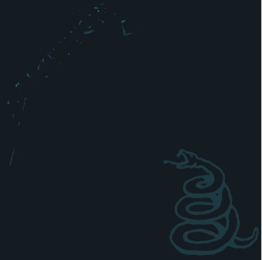
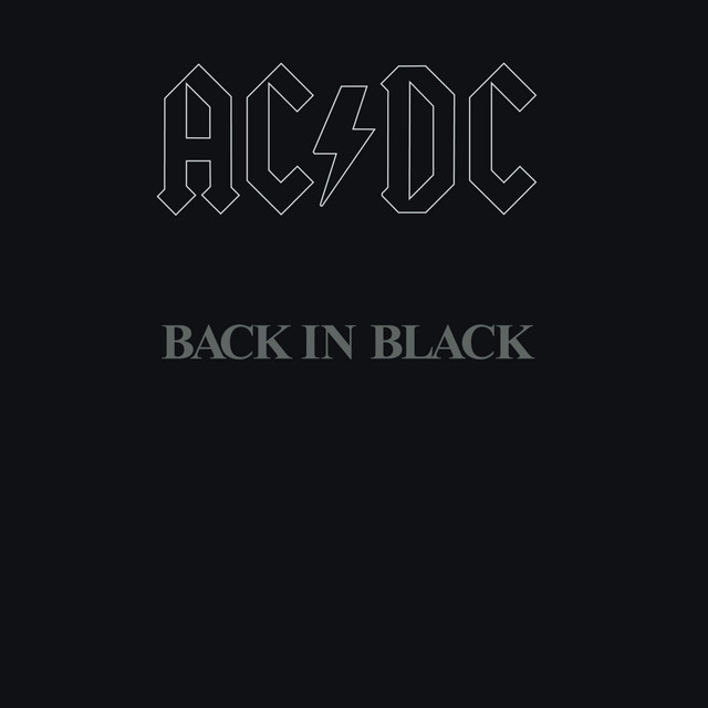
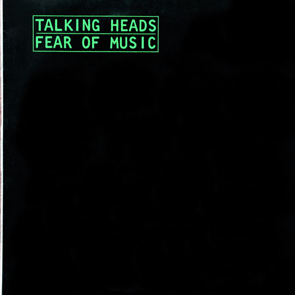

Did someone turn the lights out?
2. Bone Collector - Grave Digger
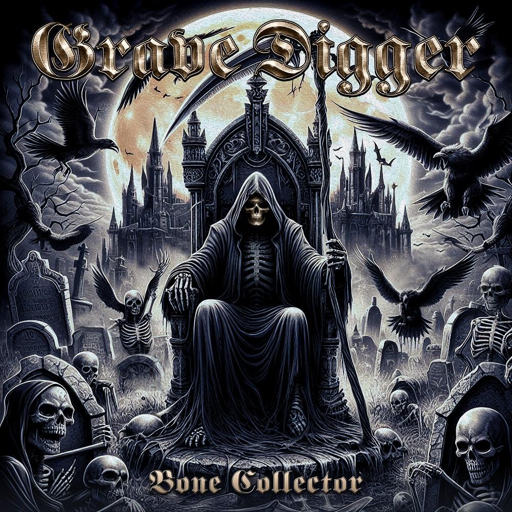
Grave Digger, one of the bands that I once recognized for having some of the coolest looking cover art, now using AI generated images for their albums. Pity.
1. Load and Reload - Metallica (again... sorry.)
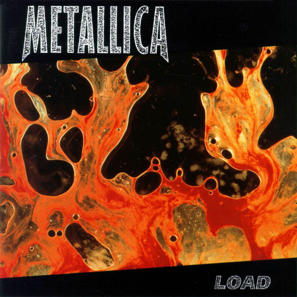
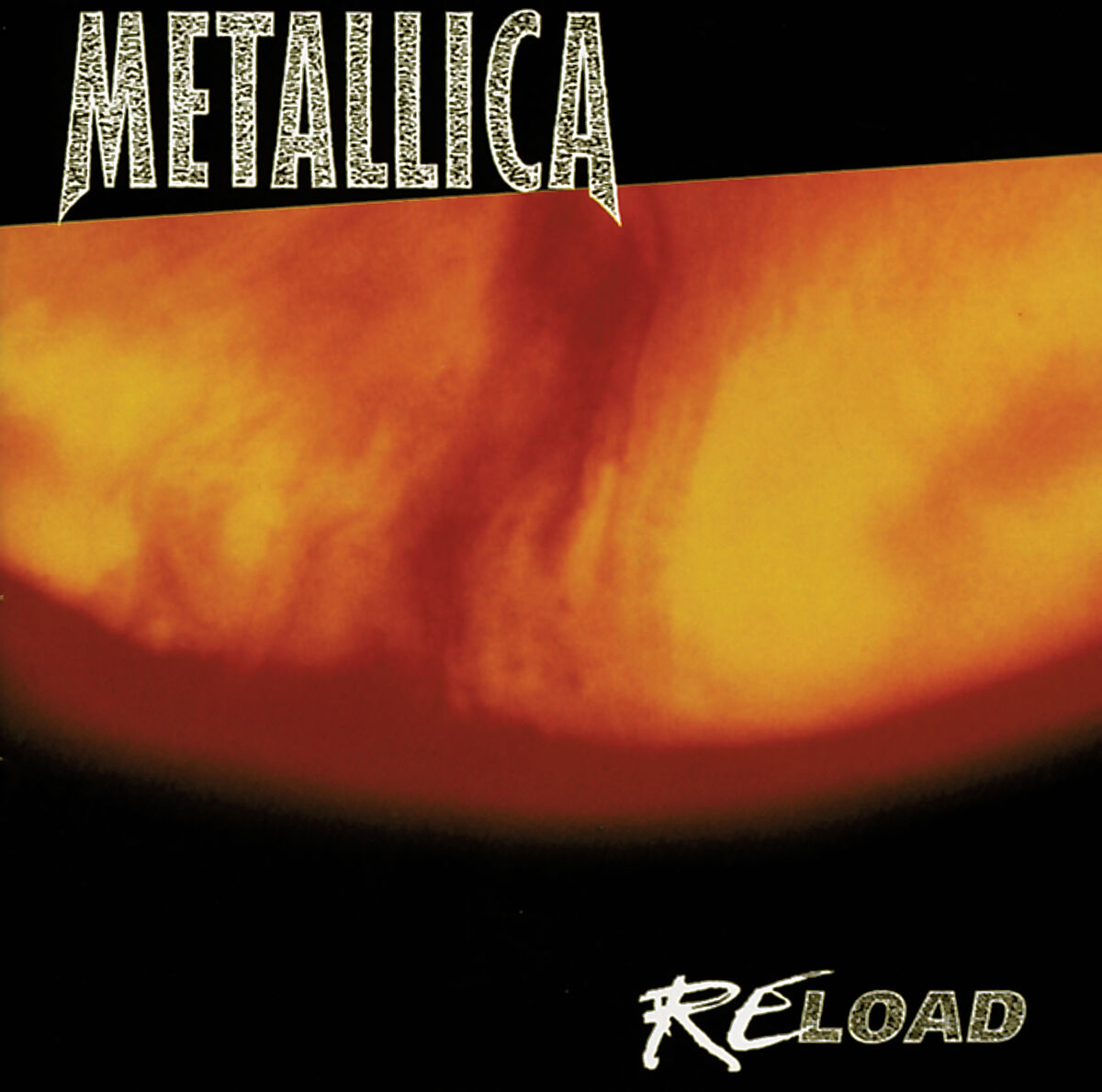
Oh, innocent young me, thinking Load's cover was a puddle of paint and that Reload's cover was the sun.
If you're stupid and don't already know what I'm talking about, it's bloody cum and piss.
More specifically: Two photographs titled 'Semen & Blood III' and 'Piss & Blood XIII', by Andres Serrano.
AND NOW... TO THE ACTUAL LIST:
10. Somewhere in Time - Iron Maiden
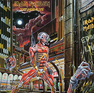
Yeah, I bet you didn't see that one coming. Before you kill me, just hear me out, will you?
Now, let me begin by saying Derek isn't by any means a bad artist, most of his pieces are absolutely phenomenal. But in all honesty, this drawing is way too detailed for it's own good, there's just too many things all crammed into one small square, it's a complete eyesore to look at, and that puke-shaded color palette doesn't do it any better, it just looks like a really gross, dirty bathroom; which I believe is the reason as to why the Iron Maiden logo is so tiny on this one, since they didn't have any space for it and they couldn't make it stand out against those bonkers background colors even with a border.
(speaking of which, it also says Iron Maiden... twice, for whatever reason)
Eddie is also just painfully small in scale compared to the rest of the artwork, which is specially offputting.
9. 'the Blue Album' - Weezer

For whatever baffling reason, instead of taking an actually good picture of the band like in the Green Album, they decided to all just... Stand there?? Like a bunch of soulless manniquins? It looks like a high school yearbook photo.
Why do they all look so off? Were they FORCED to be in this photo or something? They look like they're being held at gunpoint.
Despite all the things I just said, it's not THAT bad... It's... decent. And it is a pretty iconic cover after all, hence why it's not higher on the list. (Although I do blame it's popularity for having started the dumb trend of making half of Weezer's discography have their covers be carbon copies of it. Seriously, it's so stupid, you didn't see Metallica make like 5 sequels to the Black Album did you?)
8. Queens of the Stone Age - Queens of the Stone Age
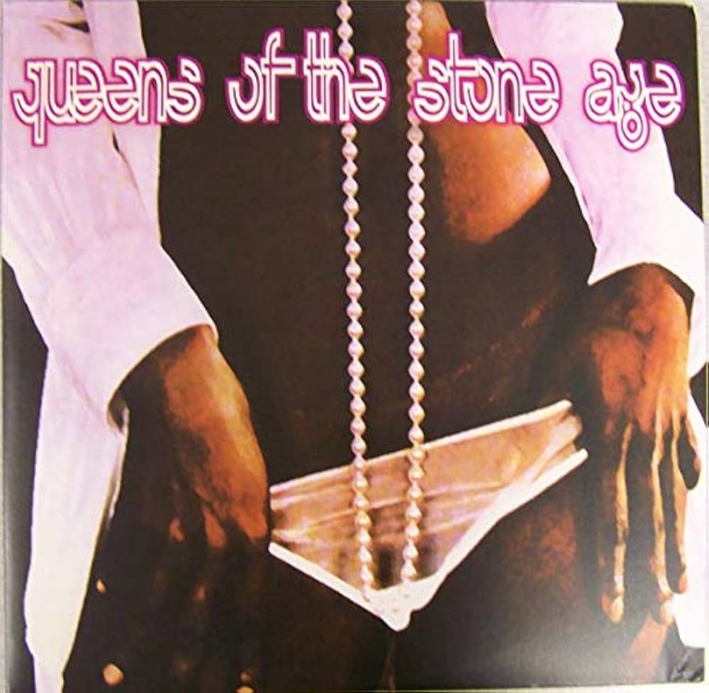
...It's just porn.
That's it, that's the cover, it's just porn,
No cool artwork, or photograph...
Both covers of the album, porn.
I mean... It is pretty eye catching, I'll give it that. Chicks sell! But you'd have to have the world's biggest balls to make your DEBUT album have literal pornography as it's front cover.
7. Fallen - Evanescence

Hello there.
6. Aerosmith - Aerosmith
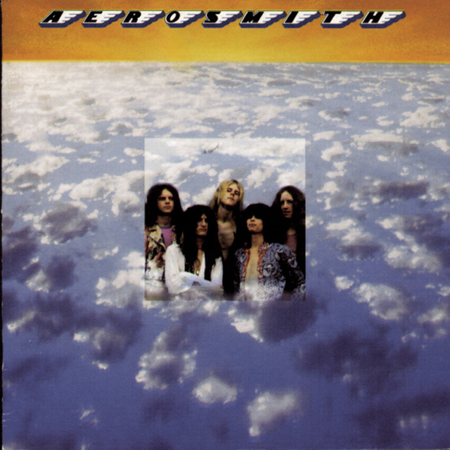
The uncanny valley of music covers, it's like-- half cool, half really shitty. Did whatever editing program they were using bug out, Or does Aerosmith just have really bad taste?
...Even though editing software didn't exist back in the 70s...Eitherway, that tiny little image looks silly. And that font is just horrible.
5. Reinventing the Steel - Pantera

(Nice shorts!)
Speaks for itself... Baby's first photoshop.
Kudos to Phil for somehow making fire look stupid.
4. The Life of Pablo - Kanye West

Call me uncultured and unintelligent or whatever, but just because your cover is "le artistic and deep" doesn't mean it's automatically good looking, this just looks like a broken Word document.
Colors are terrible, editing is terrible, and it looks like their cat got on their keyboard while making it.
I mean, it's Kanye West, so I don't know what I expected.
Nice ass though.
3. Stay Hungry - Twisted Sister
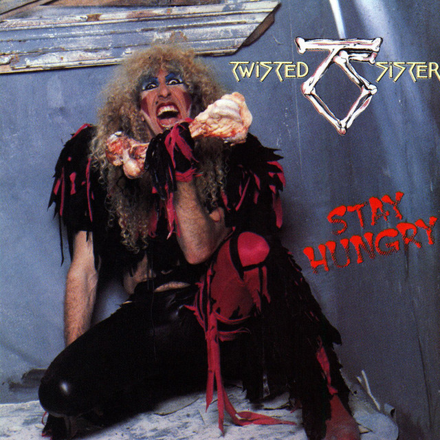
It's just an awful photo, man.
There comes a point where an outfit can be so outrageously over the top, it just stops being cool, and becomes completely absurd. I hate, HATE drag, it looks stupid, and ugly, and weird-- and I don't like it, not in the slightest. It's like those costumes Mordecai and Rigby made out of literal trash.
2. Goblin - Tyler, the Creator

?????????????????????????????????????????????????????????????????
1. The Angel and the Dark River - My Dying Bride
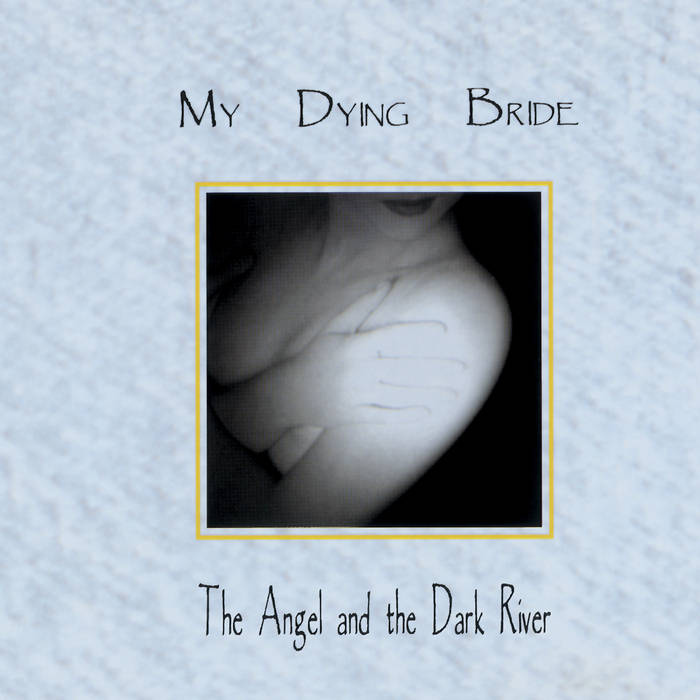
Now here's this one I've never seen anyone talk about, probably because it's so obscure.
From all the album covers I've seen, this has to be, hands down, the most god awful one I've ever had to lay my eyes upon.
The colors, they're all crap, they don't mix well with eachother at all, it's like if 6 year old me colored it, and that background texture-- it looks like fucking toilet water.
The text, not only does it use PAPYRUS out of all fonts, it's also ridiculously miniscule, along with the image. Thing's not even CENTERED. It's like if they made this while drunk and about to pass out or something, how did this get through?
It's not like this was their first album or anything either, it was their SEVENTH, and if you look at the covers for all the other previous albums, like-- they're still bad, but at least they're PASSABLE, they didn't give me a migraine just from just looking at them, so what in the ever loving fuck happened this time?
The only good thing about this cover is that little image of the woman, it's quite ominous, and it definetely fits the music's atmosphere, but then again, it's unfortunately ruined by... Everything else.
Posted on: February 22nd 2025
I'll probably update the images later on, they're pretty bad... I just saved whatever results I got from Google, I didn't have enough patience to tediously download them from Spotify.